Monday 12 November 2012

Final Evaluation

Into
These images below are what i would like to use for my digital finals for this project due to them  being coherent with each other and keep with the vintage theme. I will also be printing a darkroom images as this is an older technique and works well with my theme and is a vintage technique.


I chose this first image because of its uncertainty within the content, images like this keep the viewer looking around the frame to find some common ground with it. This gives the viewer less to look at, but it also keeps the image simple and easier to remember in their minds. This is also a good example of putting my own twist on urban space, i have chosen to do this at night because I really think that low key lighting situations are more dramatic in their content.


This second image is one which I have edited within Photoshop with the Sepia technique which I showed earlier. This image is very strong in the foreground straight through to the back as its lines and content keep the viewer interested. I really like the way the wall from left to right keeps you bouncing off it from other parts of the frame but is not to hard on the eye. By adding the sepia tone I have given the photo an aged look.

This last image is produced in the darkroom because I feel that it was the best way to display the aesthetics of this image. In the darkroom you can capture texture very well, this image has a wide range of texture and they hold within them perfect whites and blacks. When scanning this into the computer I would loose all of this. If i was to loose it my image would be very flat, therefore not having as big of an impact on the viewer.

The Project as a Whole:
I have not enjoyed this project as much as I would have liked to, this is because it had a lot of potential for me to go all out on my style and really capture some good images. But due to there being trips and other distractions I did  not get fully into the project and the images are just mediocre. So the images selected to me are the best of a bad bunch.

Improvements:
I feel that in my nest project there is a list that i could work better on, by doing these in my next project I hope to get a better grade and improve my professional development.
1. Use of my Book- In my next project I hope to use a book instead of a blog as this allows me to present my work in a more professional state. It will also cut out all temptations to go on other site such a Facebook.
2. Selecting a Theme- In this project I was late about deciding what theme I was going to base my workings on. So in my next project I will decide quickly and run with it and therefore i will create more in depth images.


Sepia In Photoshop

Introduction:
Sepia was originally a toner in the darkroom which made the image turn brown. This also happens to an old aged photograph. In these times this affect is sought out by people to create a vintage image like i wish to get with mine.   This is the processed involved in this:

First you must add a filter to the image you can select this tool from the quick tool box on the right hand side.

  Then on the drop down menu select the sepia option and then select your decided opacity.

  You would normally want this a 100% as it is not very visible and it is still faint, but this is part of the affect to the image as you want it to look like an aged photo.

Sunday 11 November 2012

Acrylic Transfer

Introduction 
As I said earlier on this blog, that I wanted to to revisit this technique for my finals. By doing this I can see which technique i have tried would best bring a vintage effect to it.


  This first image is is one with a very simple colour affect, this is similar to sepia toner in the darkroom. I prefer doing it like this as you can get the good texture of the paper beneath it. By doing this I also give the image a aged faded look to it, this sticks to the vintage theme.
This piece is one of an experiment for me, i have never tried putting two colours together in this technique. When looking at this piece you can see that the juxtaposition between the two is very noticeable. But this can be used to the images advantage  as you can single out pieces of the image to draw the viewers eye. 
With this last image I wanted to give a physical aged affect by rubbing too hard in certain places to actually take away particular pieces of the image. By doing this I leave ministry for the viewer and let them think what it could be. By doing this it makes the image stick in the viewer head and this is what I want to to so i can show my message.

Conclusion
Out of these three individual spins off's of transfers, i feel the the sepia/ brown colour works the best with my images as it does give an aged and vintage look it any image. By using this I can get the most out of my image as  it does not hide any piece of the image.  

Saturday 10 November 2012

Truo Shoot contacts


College Contacts

Truro Shoot Plan

Aim:
I wish to create a body which compliments the style of Eugene Altget. His style is one which captures a true story to all of the spaces he shoots. These images will be of different ages of the scenes but this is because my setting is very diverse. Doing this will also allow me to place my own style among the photographs.  

Equipment:
For this shoot will be using the following equipment and the reasons for it choosing:
1. Canon 600D- this camera is the highest quality that i can get hold of so the images will be very crisp and sharp so when I print they will be to a high standard.
2. I will be using the 50mm 1.8 Prime lens as this lens is which most of the photographers which I have researched use.

 Where/ When:
This shoot will be done in the middle of Truro near the cathedral as this area has the architacture that I am looking for within my images. By selecting my area i can also allow myself to find more angles for my shots, by doing this I can have a higher hit rate of what works and what dosnt.

College Film Shoot Plan

Aim:
For this shoot i would like to explore area around college which have very new and urban angles. These sences are scatterd around the college and are relitivly quiet so i will have no trouble getting the blank scene in Alget's photographs.

Equipment:
All i will need for this shoot is a Pentax K1000 film camera as it has a light metre built in. This is also easier for me to shoot with a smaller set of gear as i can get into better angles for a more interesting shot.

Where/When:
I will be shooting this at truro college on a cloudy day as by working in black and white having a cloudy day gives a nice blanks sky so this will contrast with the urban scene very well.

Tuesday 6 November 2012

Acrylic Transfers

Introduction
Acrylic transfers are one of the oldest techniques in reprinting an image. As the name suggests you use acrylic paint to achieve this technique, the good thing with this technique is that you can transfer the image onto almost any surface. This is a really good way to make sure your image has texture within it.

How dos it aid an image?
The effect of an acrylic transfer is really as I said before, is to give your image more texture. By this i mean physical texture as you can doing this technique on clothing walls and any place that the paint can dry and not move. By doing this you also give a vintage feel to the image as well because the texture you give it makes it look like an aged photograph. This process is very much well suited to the vintage theme and to my project.

My Examples


As you can see from this image above that the process is successful as I have an image which is backward. This is an effect of the process as you are transferring and not copying it. Around the image you can see that pieces of it are missing this is due to the process being very delicate. As you wet the image to rub the paper off it is fragile and by rubbing to much to take away the print. This does not mean that you take away from the  image though, in fact it makes the image looked aged and more vintage.


Now this image is again well done but not fully completed yet though as you can see the paper has not been rubbed off properly. By not doing this you leave a milky effect and although it add texture it take the colour away from the image. This transfer also has blobs of paint which are still visible this is because by using some paint you it dries with a tint. But this is due to  applying the paint to thick to the paper and the image is left on the original. 


Now this last image is one that combines all the aspects which i have mentioned, apart form one thing. This is that how we trust this transfer. We actually think most trust worthy with these image than normal, this is because when we know that the original image is an normal image. We discard the way we think its been made as are more focused on the process and what it has done to the image. By having this mind set we as the creator can focus more on the way the image is shown through the technique and what it brings to the image. 


Plan
In my further shoots I wish to trial these techniques and see which will work the best for my finals.

Monday 5 November 2012

Revising Burning

Introduction
From my first attempt at burning negatives I said that I wanted to revisit it and expand my knowledge of it's affects. Below is an analyses of my result and why i would use it in the future and what for.

This image is a prime example of the effect of stretching the negative in such as way that you turn it into a different subject. In this photograph you almost feel that you are out of reality and in a serial world. The elongated face and eyes. This effect to me can only really be used on the portrait images, this is due to if you change people then it seems even more effective.

Phase Two Night Shoot

Introduction
In this part of my work I will be analyzing photos that I have chosen from my contacts. Below you will see the annotations of the images and then I will talk in depth about them and their good and bad points. the images are number as follows 1 2
                                             3 4
                                              5


1. This image is one which is very close the the effect that I wanted to create as a final product of this shoot. It has a a dark and gloomy aesthetic to it, this is achieved by the lighting being separated within the frame.By doing this the viewer is consumed by darkness and the information seem in secret. Despite this good lighting the image is ruined with the for sale sign on the right as your eye is drawn to it and then you are thrown out of the photo. 
2. This second image again shows a good contrast between the highlights and shadows and by having really only the car in the frame you keep the reading of the image simple for the reader. This is helped by the darkness being all around the perimeter of the frame, placing the viewers eye in the center of the image allowing you to be lead out by the road. This image has a dreary feel to it and makes the viewer wonder what is in the darkness.
3. Now this image has less of an impact to me due to its position in the road. By being in the center of the road all i have achieved is to show summitry. But as you can see again that the for sale sign is in the right of the frame again distracting your eye but this is also done on the left side by the building. It's structure is large and it catches the ambient light very easily thus being easy to see and bold within the frame.
4. When looking at this photograph at contact size it seemed to be in focus and the lighting was perfect. But when you look at this photograph in a larger scale you see that all of the frame is out of focus, meaning that the image is unusable as a final print.  But the idea i think works very well and it is worth revisiting it at another time.
5. The lighting in the image has really disappointed me as the huge light streak has taken away all the drama from the photo as it goes right across the image. By this the whole images is warm and not anything like the affect i wanted and it will take a of work to set it right in Photoshop so i will leave it and shoot again.  

Sunday 4 November 2012

Night Shoot Contacts


Night Urban Shoot Plan

Aim:
The aim of this shoot is create a collection of images that show the urban space that I am often exposed to. I also want to show these space inn a eary and dramatic way which is coherent with my style.I hope to be able to also take these images further for post production to help make them vintage through the techniques which I have explored.  

Where/ When
I will be doing this shoot around my local community and exploring its different spaces and how they are and are not used. I have already got some different places in my mind and wish to show them some a variety of different angles.  I will be doing this shoot at late afternoon and to late evening as the shots I wish to capture need different lighting situations so this means I have a short time at each location.

Equipment
 For this shoot I will be using the following:
  1. Camera digital 
  2. Tripod 
The reason for this shoot being so simple is because I do not want to manipulate the the environment until I get to post production where all of my vintage affects are made. 

The Chemigram

Introduction
The chemigram is the name given to the process of painting with fix. This is done before the paper has been exposed the light under the enlarger. This means that you stop the paper from developing while to go through the process as normal afterwards.

Attributes
By doing this process I cannot really see any real good use for it within normal darkroom printing apart from drawing with the fix on the paper and then over exposing it. By doing this your image will be white and very easy to see on the paper.

My Examples
 Below is an example of the chemigram and how the effects of painting with fix can be shown
 I created this image to see what could be achieved by the process as I have never heard of it before. I feel that this image really shows a dramatic a different approach to creating images without a camera but still have the same dramatic and engaging feel .

Next
With my forth coming film images I would like to tray doing this but with developer and see what would happen to the image. By doing this i hope to create another vintage aesthetic to my images. 

Friday 26 October 2012

Urban Space

Intro
As i have chosen to take photographs of empty streets in their natural beauty I thought it would be good to research the Urban Space and how other photographers have used it to create their own style.Even though I have studied the great work of the old street photographers, there style was evolved round their time and surrounds I must adapt my research to the way that I work and my surroundings.

Examples of the work
This image is a great example of using old technique to bring vintage aesthetic to the modern world. I can make a logical guess to what camera this was taken on, a 5x4 as the image is portrait and the top of the image has been disrupted by something very close withing the camera which is a typical affect when working with these cameras. I also really like the shadows of the bridge and how it follows the dark and contrasting theme to the photograph. This is how I wish my photographs to look like when I shoot in the near future. I wish to capture the way that the streets of my town look on the twilight hour of the early morning and evening. This will bring the dark affect and keep the traditional town which seem to be forgotten in these hours.


This image below I have chosen for a different, it is the way that the subject is being shown and how its character and reality go hand in hand within this photograph. By this I mean that from the image you can see the it is a big status building and may carry a lot of authority within its walls. When looking at the photograph form a connotative point of view you can see that the angle of view that the photographer has given the viewer is very low and inferior to that of the building. This is a great way showing an in depth piece of information in a short amount of time and it is what I would like to do through out this project and show reality not just through seeing but through reading the image as well.  

Burning Negative Plan

Aim:
The aim of this is to progress in the process of burning a negative and printing it in the darkroom to give  the original image a sign of my style. At the end of this I wish to have a portrait which has been distorted in a way which give a serial affect and puts the viewer on edge.

Equipment:
For this process I will be using the following equipment because of the reasons stated:
1. A Portrait negative- I wish to use a portrait as, people are the most thing people see and by distorting a          person you give the reality a surprise of difference for the viewer to see.
2. Lighter- A lighter is the best way to burn a negative as it is flame but its height can be adjusted for different affects, it also can be left on for a long period of time makes the negative burn longer distorting it further.
3. Assistant- By having someone else to hold the negative tight I can burn the negative much more to the way that I would like the effect. Also by having the assistant I can stretch the negative slowly to distort the effect.

The Affect:
For this I would like to explore on a part of this technique which I discovered the last time I visited it. This was that when heating the negative slowly you could stretch it and elongate the face of the portrait making them look like a demon. With my first try I did not want to go to far into it as I wanted to find all of its aspects that I could revisit if i enjoyed them. This was my favorite of them all and i wish to try it today.

Darkroom:
In the darkroom I will treat this as a normal photograph trying to get a corrects exposure with a perfect white and black within it. I also would like to get a high contrast in the image as it will create high drama within the image making the distortion more apparent and strong to the viewer.  

Thursday 25 October 2012

Eugene Altget

His work 
Altget is another photographer like Basilico that took pictures of street with great shape and character. I am researching him because of the way that he shows the streets as stories and how the vintage aesthetic he shows helps his photographs.
Atget often took photograph's like this one above with a tree in the centre of the image. This is done to his images because, by having the tree in the centre of the image Atget has shown mother natures beauty and behind therefore being inferior to it is our man made beauty. This is a very front on way of showing his message but works really well. You can see all over the image that here is a sepia aged affect to it. This effect is one which I would like to do to my images with toner in the darkroom. By doing this I will send the message that although everything else ages beauty does not.  

This image is of part of Atget's work in the way that he shows streets. You can see that the path follows the signature S of the normal landscape photographer. This say that this is his great hills and valley's and they are beautiful too. By shooting this in Black and White I will also show in my images that I want to show my landscape as the greats did such as Ansel Adams and make my world which has changed to his and show it beauty. 


Proposal

Introduction
For this project i would like to have an aim to my images apart from being just vintage. By this i mean by coherently keeping with one theme and putting my own twist on it and using the techniques I have already researched to present it.

What do I Want to Achieve
At the end of this project I would like to have a set of two images that both show the subject, similar to that of Gabriele Basilico with his great empty streets and the in depth detail he shows.

Gabriele Basilico
This image is a great example of what I am looking for. The photograph has a very ordered and modern approach to its composition. I really enjoy this image as it almost looks like it has been solarised but could not be due to the lower half being in the right.

Why this subject 
The reason for doing this subject for my vintage is because by doing urban landscape I can show all these different lines that you would not normally see. This subject also work really well with the techniques which I have researched and plan on doing more on work.

Wednesday 24 October 2012

My Scratched Negatives

Below is the image that I created with a scratched negative in the darkroom.
When doing this effect I cant help but feel that an 80's retro aesthetic has over come the image. By this I mean the outgoing lines that really just emboss the images and make you look at what is acturly there instead of, just glancing a the image and not think about the message behind it. 

My Burning Negative Result

This image below is the negative that I burned to create the effect that I researched.

This negative is the neater than expected because of the way that I burned it, as the normal way is with a light below it  far away. I flipped this on its head and held the lighter very close for short bursts this allowed me to keep the film straight so I could keep a usable negative. This also let the negative bubble in several places keeping the effect consistent. I enjoy doing this as you can really distort the photograph  to my meaning and add to its aesthetic instead of taking away like most things. I will be soon trying this method again to get different affect and progress in my understanding of its ability and aesthetics. 

Saturday 20 October 2012

Scratching And Burning Negatives

Introduction 
Photoshop can manipulate images without harming the original image  with film it is a different story and you must harm the negative to create a real texture and effect. A couple of these affects are scratching and burning which is what i will be doing for myself in the future.


Scratching
Scratchings clue is in its name to what it is all you do it scratch the negative where you would like the effect. This effect works very well on portrait as you can use it as a textured framing.

                   
As you can see with this image by scratching the negative the created has turned it into a drawn looking image. By doing this you confuse the viewer into looking for realism as we have been made to look for within a drawing but yet it is, a photograph. This effect also fit in with the vintage aspect as this makes the image look like an older photo and it has been aged.    


Burning
Again it is a very simple and easy technique to apply to your negative as you just burn them. As i said this is simple but if you burn the negative for to long, otherwise you will loose all detail within it and it will be useless.
This image is the perfect balance between the two you can see the image and see the subject but are brought away by the burning affect. As you can see by doing this effect the image almost becomes secondary to the effect.  This effect is one that cant be used lightly due to its mass effect Never the less it's vintage style is still used today by a mass market. 

Thursday 18 October 2012

35mm Results

I like this image and the way that the frame is filled well and even though there is a lot of free space it still holds information for the viewer to look at and asses. The building in the left of the image works really well as a leading line bringing your eye from the top left to the center bottom of the image. The way the sun refracts from the building add a heavenly feel to the image. This affect was commonly used in older times as it was a in camera effect and gave the images a lighting effect which was unseen by the human eye.   

Now this photo holds a bit more of a fine art asthetic to it, this is due to the composition and the way all of the lines flow with each other. Im talking about the windows lines and how it is smooth and contridicts the subject lines. The great thing about this technique is that you can see the writing and number on the film within the photograph. This give the photo a sense of reality and brings it into perspective, that it is an image not a real thing but encaptured time.

Shoot Plan (Simple Composition)

Aim: 
The aim of this shoot is to explore the style of simple composition and how I can use it to make my images look vintage and grand. This shoot will be small due to small amount of subject is have but I will use as much experimentation as I can to change the appeal to the image but still keeping within this style.   

Subjects:
The subjects I will be using for this shoot is mainly older cameras, as this technique is mostly used for these subjects in the world of photography. I will also try and used more old forgotten things within this shoot to really bring the subject of vintage to the subject. 

Lighting:
From previous attempts at this technique I know that using single lamp lighting it the best way to add excitement and drama to the image. By doing this I feel that it will showcase the subject in a much more simple and dramatic way.

Where:
This shoot will be done on my desk at home as it it made of wood and that will add the message of age as a texture, to the subject and image. By doing this i will also add to the colour scheme.  

Equipment:
For this shoot i will need the following things:
1. A lamp for the lighting
2. My wooden desk for colour and message reason
3. My subjects for the photographs
4. I will need some colours as this will help the compostition
  

Wednesday 17 October 2012

Simple Contacts

Below is the annotated contacts from the simple plan shoot.


Wednesday 10 October 2012

Simple Composition

Introduction
Product photography is one thing which really sets itself in a different light during the 60's and 70's. During these times the techniques which were discovered are now being replicated today. In this piece of work i will be look at the work of Cuba Gallerys of flickr. As he has got a great style which is typical of the 60's and 70's. 
This image is one that holds all the of the cliche of the 70's colours and advertising style, this shot is composition wise very simple in the sense that is follows the rule of thirds has a good straight line of sight. The main this which makes this shot is the colours they all bounce of one another, the blue and red both fight to be seen more within the shot. This technique is one that is very effective especially when you start playing around with the curves and desaturate the image. Another part of this image both adds in texture and message. This part is the table it shows an old wood table with distinctive grain, By adding in this feature you follow the theme of vintage with the again of the product, this again aids the message and how they want to show that this is a old but yet grand object. This point if also supported but he camera being on the book pedestal as it is a great thing.  By showing the wood table to also keep the shot very simple, you are not confusing the viewer into thinking something false due to the angle in which the object is shown. This image does very well in showing the viewer what the main point of focus of their eyes should be by singling out the object and keeping the whole frame simple.     

  The Use of Colour

This is another of Cuba Galleries photos which again are simple yet effective. What I want to draw attention in this image is the way he uses the colour in the background. You might ask what is in the background, well that is completely irrelevant as it is out of focus anyway due to the the extreme shallow depth of field.There is a strong divide in the colour of this image as you can see in the background that there is a red and black side to the photo. This it to show the child nature of the crayon because as we were all younger we never blended colours so by having this bold divide you make this more obvious to the viewer. Using the shallow depth of field is also another way to single out your subject, again keeping it simple and effective.   

Tuesday 9 October 2012

Caffenol Print


These images are the process of printing my Caffenol neg in the darkroom. 

This image is my result after doing a couple of test strips on a filter 3. As you can see the images is dead central but some how works by using the wall as a guide I have brought the viewers eye to the shoe which then leads you around and out into the top right corner. It is a shame that the top right corner is blown out but this helps the eye leave the photo. The focus on this image almost looks like a tilt shift as the depth of field is so shallow. This both aids and steals from the image. This is because it dose not keep your eye on the show and shows that the shoes are the vintage subject, but it also makes the floor look poor as it like someone painted a strip of focus on it and not thought properly.


This second image is an attempt at burning in the ares which were blown out, i have tried this as the photographer Ansel Adams had a piece of information in every part of his images. I have never done this darkroom technique before so it was a touch and go weather it was going to work or not. This time it has not worked and i have held the the card to close so the lines are very clear. But i feel that this has created a new age retro feel, something like the surf advertisements you see of today like the one below apart from this one is in black and white. This retro style is something which i would like to recreate in the future even though this is a ad it still holds the style I am looking for.  

My Cafenol Contacts


Caffenol


What is this Caffenol?
Caffenol is a home made developer for the "working man ", its clue is in the name that is is made with caffeine. The most commonly used source of caffeine is coffee, this is due to its high contents and cheapness. Doing this developer has characteristics which can put affects on your prints and film. 

Prints
This developer is one which can be adapted to the darkroom from paper to give a stained affect.

This images is one that has been toned with coffee in the darkroom as you can see that the affect is a sepia like stain on the paper. By doing this affect you can immediately suggest that this is a vintage style image as this affect would naturally only happen in old faded photographs. When doing this technique to this photography to you can also aid your message like this photo, by placing this effect on the photo you could suggest that dog racing is a old sport as the images seems to be old.  


I will be trying this technique for myself with a 35mm film (B&W). In this shoot i will be shooting in a vintage style of subject also to the technique as this was the improvements from my last shoot. 


Monday 8 October 2012

My Medium 35mm

Below you will find my contact sheet for my 35mm medium format attempt which has seemed to come out very well due to there being images on the film.

Vintage Subject

Introduction
As well all know photos must have a subject, a meaning to it. Weather that is just to advertise something or create questions in the mind of the viewer. This is a big subject within photography and needs to be seriously looked at when ever composing a photograph. 
This process is known as subject matter. 

What is a vintage subject?
With choosing a vintage subject you need to research what works and what doesn't. But with the vintage subject all you really need to do follow the popular crowd in to what is trending in the photos. A good place to look for this is Instagram which is a new application which allows you to take images and make them vintage. When looking around the instagram website I found that the best things that work for this is stuff that is from the time that the person wants to portray, if that is the sixties it might be a camper van or the most common is cameras from the time. 


Picking My Subjects
When picking my subject for my photographs I will be assessing what place in time I want to show as this is will be the main message about the image and what is want to say. If I do not do this then my images will be of a poor composition as it will be a inconsistent theme to the image, therefore confusing the viewer which will then render the message and images useless. 

Example

This images is something typical of the work of a point and shoot on Instagram as it has the aspects which are easy to like as it is currently "trending". First you are blasted with these odd colours which suggest cross processing which was originally a mistake made in the 60's which has never lost it following. When looking at the camera you see a common shot a a 45 degree angle of a camera still seeing the lens. I feel the reason for this type of shot being popular is due to the leading line the oddity of the camera being in the shot. Leading to why would someone do that and with the shallow depth of field it is hard to not look at the camera as our eyes are naturally attracted to sharp focus. Even though the sharpness attracts us it also pushes us to wonder what is out of focus this combined with the fading strap really adds a sense of uncertainty to what we establish and what we guess. By doing this effect with the offset colour balance you create a uncertain image which creates questions on the message.  


Wednesday 3 October 2012

35mm Technique

35mm Technique

What is it?
The technique that I will be investigating is using a 35mm film in a medium format camera, in this case I will be using a square format camera. The effect of doing this is that apart from just a small piece of the film being exposed, you instead expose the whole piece of the film. This creates the  vintage look of experimentation which was the thing to be doing in the 60's. 

Today's Practitioners
Even in this modern day of digital photographs being shot every1/4000 of a second to create a high hit rate there is still very large market for these technique. One big place to website where this community of people share their experiments is www.squarefrog.com. This is also the place where I have found various other techniques to use. Link displayed on side bar. 

This image is a great example of the process that I will be doing on another camera. Unfortunately I will be doing my images in Black and White as that is the only film that i can process by myself. But the effect of the hole of the film will not be compromised due to the shooting process to be the same. this image is most certainly enhanced by this process by giving a unspoiled view but the holes in the film keep the photo as not a mirror image but as a piece of art.  


Technique Plan 
When trying out this technique I will be trying to capture moments that are often missed when just walking around as I find that this subject is very vintage. In the case Henry Cartier Bresson capturing moment was his forte and these images make a great pieces of vintage art and technique.       

Tuesday 2 October 2012

My Photoshop Daguerreotype

So this is my final product of my effort within Photoshop, you can see the original image below. I feel that this attempt has been successful making the image look like a Daguerreotype although it will never look as good a a true original as the process is unique and creates affects which are extremely hard to replicate. As you can see when comparing to the original that there has been a complete change in what was a studio colour portrait. I have also added blur in certain places of the image to give the really effect of a Daguerreotype as the first sitters of this process would often moves creating blur, it is also made by the rubbing during the process. The scratches are a good affect but i feel when i look at the image i am distracted from the detail and are moved around the image at these scratches which have no purpose but to make the images look like something it is not so this is bad for the images art quality.   


Photoshop Technique to a Daguerreotype

Introduction

Since the world of Photoshop has come about there has been a market for how to get vintage looking images from a digital. Today i will be looking at making a Daguerreotype within Photoshop and comparing my result from the original photograph to see the changes and a real Daguerreotype. 


What is a true Daguerreotype?
A true Daguerreotype was made at the same time as Fox Talbots process which is more widely know today. This process was not using a negative but a sheet of metal and using heated mercury to create the reaction. Doing this resulted in the effect of a almost 3D image embossed within the metal.   
  As you can see from this image there is a very shallow depth of field this is caused by the camera but can be seen much more clearly from the metal. By having this effect on your images to capture the sitter in the in the sitter in the metal making the final image more realistic to the eye, when you compare this to a normal portrait with a low apature to still do not get this effect of duplicating the physical appearance as well as a true daguerreotype. Daguerreotypes were first used a high class type of photography as they were more expensive to make and of a higher quality image. This would be kept in the pocket of a higher class person and would normally hold a loved one inside. When looking at the images as a piece of art you can clearly see in emotion of this sitter as with his aged face a is a strong man with a tough life but now has found peace. Due to the shallow depth of field you are immediately brought to the sitters eyes as they are perfectly in focus and really shows the message from the off.     

Photoshop Daguerreotype
This image is a Daguerreotype images that has been made by someone in Photoshop from a normal digital image. As you can see that the eyes are still the main part of the image and are the catching part of the image. You can also see that the depth of field is still very shallow, doing this brings the parts that are in focus even more dominant. When looking at the artistic side you can see that this image was not meant for any artist purpose as it is a snap shot and only really hold sentimental value as our culture is very much of loving pets. 


Plan for my Photograph

For my attempt at this technique i will be using a portrait as i feel that it makes the effect is more worth while doing. As the very shallow depth of will only take true affect when  you have a subject which is with real detail like wrinkles on a face. I will also need to have an image that has a perfect Black and White as I will also be making sure the contrast will really give a high quality photograph. 


Monday 1 October 2012

My Large Format

My Results

This first photograph is reasonably successful in the sense that i have actually got an image on the paper when   doing this technique for the time. When actually looking at the image as a piece of art is dose not really hold a value, this was an attempt of a long exposure with subject walking around the framing leaving ghostly figures. This a clearly not been reflected within the frame but this may be due to the paper and how quickly it reacts to light so our subjects moved to fast for it to record any information.


This second image is one which again not worked for the main purpose for which I intended in showing ghostly figure within the frame. Despite this you can see signs that this has been attempted. This can be seen in the shadow of the in middle left of the image where it has gone grey instead of the pure white which we had before hand. This is because there must of been something for part of the exposure there to block the light, that being my subjects moving within the frame. As you can see on the whole of the scanned frame there are darker spots than others but this is not down to the exposure but the developer in the dark room being over used. This means certain parts of the image have not been developed as much as others creating this blob cartoon affect. I feel that this adds to the vintage look of the photograph and creates questions within the viewers to what these blobs are caused by and what do they mean.
This image has come out a lot better than my other due to have a well exposed photograph which actually shows on the paper. This photograph is faint which could be due to the developer in the dark room again being over used and then chemicals which do not react with the silver halydes enough to bring out the bottom of the image. When looking closer i see a long leading line from the bush on the right around the image letting the viewer take in all the information i want to show them. This composure has been taking from the work of Edward Weston, i feel that i have taken the technique and molded it to what i want to use it for instead of from was just practicing but i can still use it.   
                                           
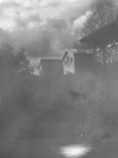
This photograph is a little more intriguing in the fact that some of the image has been correctly exposed and other parts have not so this raised questions about how this has happened. After some hard thinking i feel that i have found the answer of what has gone wrong, It is the papers exposure range is not large enough to keep the whole of the image within its capability. What i wanted to achieve with this image was to show a real Ansel Adams technical aesthetic with the image and have a true black and white is a simple photograph. Unfortunalty this could not be accomplished with the kit i had so this has not worked and i have not got the affect i wanted. What i have managed to get from this photograph is a very well exposed sky which shows the clouds in great detail.


Conclusion

In conclusion i feel the i have made some images which are good examples of 5x4 experimentation. If i was to do it again i would use actual negatives as it will give me a much better result then positive paper as i will sure fire information on the ISO instead of educated guesses. One that is worth learning with this technique is your patience and really thinking about your image instead of just shooting away i must think about my composition.